30th Disco Tray Studios Reflection (Summer Edition)
this week!
Eclipse website
I started off the week meeting with Dr. Wright. In my Databases and Websystems class, a group of students made a website for her Eclipse event that she is hosting on campus. The website has been made and all that is left is for her to add in all the pertinent information. However, when she tried to run the website locally she was getting a weird bug. So I met with her on Monday and after about an hour we figured it out. It’s funny, because I am every experienced with software things not working and so I’ve learned how to power through and continuously search the error until I can fix it. So, even though I didn’t know initially what was wrong with her set up, I did know how to work through it. Someone else probably could have done it a lot faster than me but I can still do it (story of my life).
Lake Nixon
We were finally able to meet with Lake Nixon to show them the progress on the scheduling app and they really liked it! They even suggested that a generic app for other summer camps. That will take some extra work but that just goes to show that the app is that good. Teddy has really pulled it altogether!
Hendrix Today
Dr. Goadrich was able to successfully add a login function so only students, faculty, and staff can use it. I am so impressed at where this app is and have really appriecated the consistant aesthetic. This is something I have been trying to figure out for the UI of the Water Quality Testing app. How to make it look more than just barebones but also not too over the top.
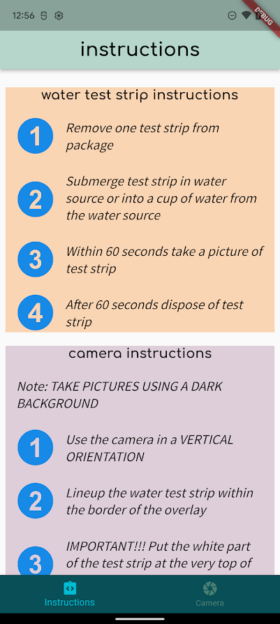
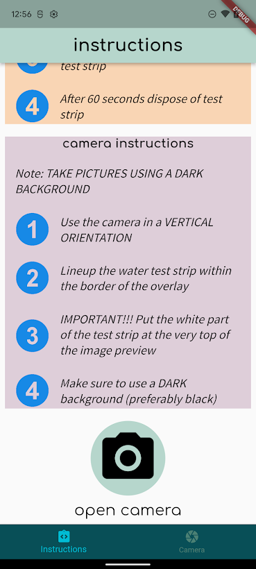
Water Quality Testing
This leads me to what I have done with the Water Quality Testing app. I was working to make it look professional. However, I went a little over the top. I had too many fonts and the background picture was too distracting. So I simplified it even more and condensed the app into 2 screens. I used 2 fonts that the Varify (the water testing strip company) has and then selected a color pallet using the Coolers website. I forgot how useful Coolers is because it takes all the guess work out of what colors will look good together. Here’s what the app looks like down below.
 |
 |
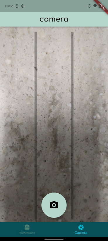 |
Also this commit closed a lot of the UI issues I had listed on the Disco Repository. We are moving in the right direction! I can’t wait to get more critiques from the other Disco members. I often get stuck trying to make something work rather than rethink what I am doing. Especially hearing critques from people who haven’t been staring at the UI for hours, is simlar to a user’s perspective.
what’s next
I think my next goal (if I continue to work with the UI) is to add an app icon. Hendrix Today, Lake Nixon, and some other our other apps already have an app icon so by our next Disco meeting I will have some options prepared and will get feedback to what is prefered. I also need to talk to Teddy to see how I can help out with the backend (because that is where he is currently working with getting the app to actually read the water testing strips)
life
I am currently housesitting for so many people right now. This might be great for my bank but it is stressful for me to continuously remember where I need to go next and what is required of me at that house. This week I will be taking care of chickens at one house and parakeets at another house + cats and dogs at 2 other houses. This is definetly is the summer that I am the most out of my comfortzone. Nevertheless, I am still trying to work out at system to help me navigate my day besides just thinking about what I need to do for the next hour. So far I’ve done everything right but it just feels like my brain is full of things I need to remember and I am worried that I’ll forget something.